Cisco Meraki · Website redesign & brand refinement

A platform story, not a product catalog.

The redesigned Cisco Meraki website
+20–25%
Lift in overall conversion rate
~100%
Of pages mobile-compliant
1,000%
Faster page loads than the old site, best case
12
Straight quarters of YoY pipeline growth the new site supported
My role
Creative Director, later Head of Design & Web. Discovery, research, naming strategy, UX, and art direction
Team
In-house UX and brand designers, a new Head of Web I hired, and Hero Digital as agency partner
Scope
New CMS and tech stack, IA and navigation, messaging, iconography, illustration, photography, type, and color
Partners
A brand-new CMO, plus our Web, Strategy, and Content teams
01 — The problem

Our marketing outgrew our website.

The old site had done its job and earned its retirement. Meraki had grown fast, and our marketing strategy had matured past what a hand-coded site could support. Launching a campaign page was a project. Running a test was a negotiation.

This wasn’t a vanity project. We needed a more robust CMS and better analytics, a full UX, design, and SEO audit, and a plan for every stakeholder with an opinion about the homepage.
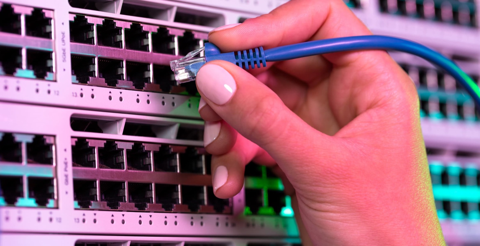
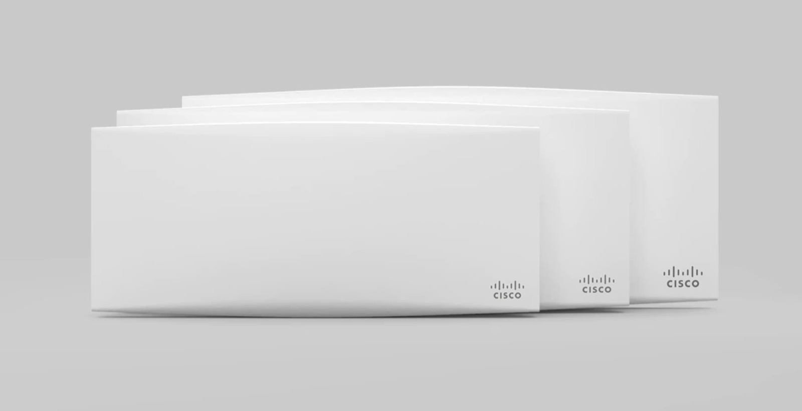
The hardware behind the network
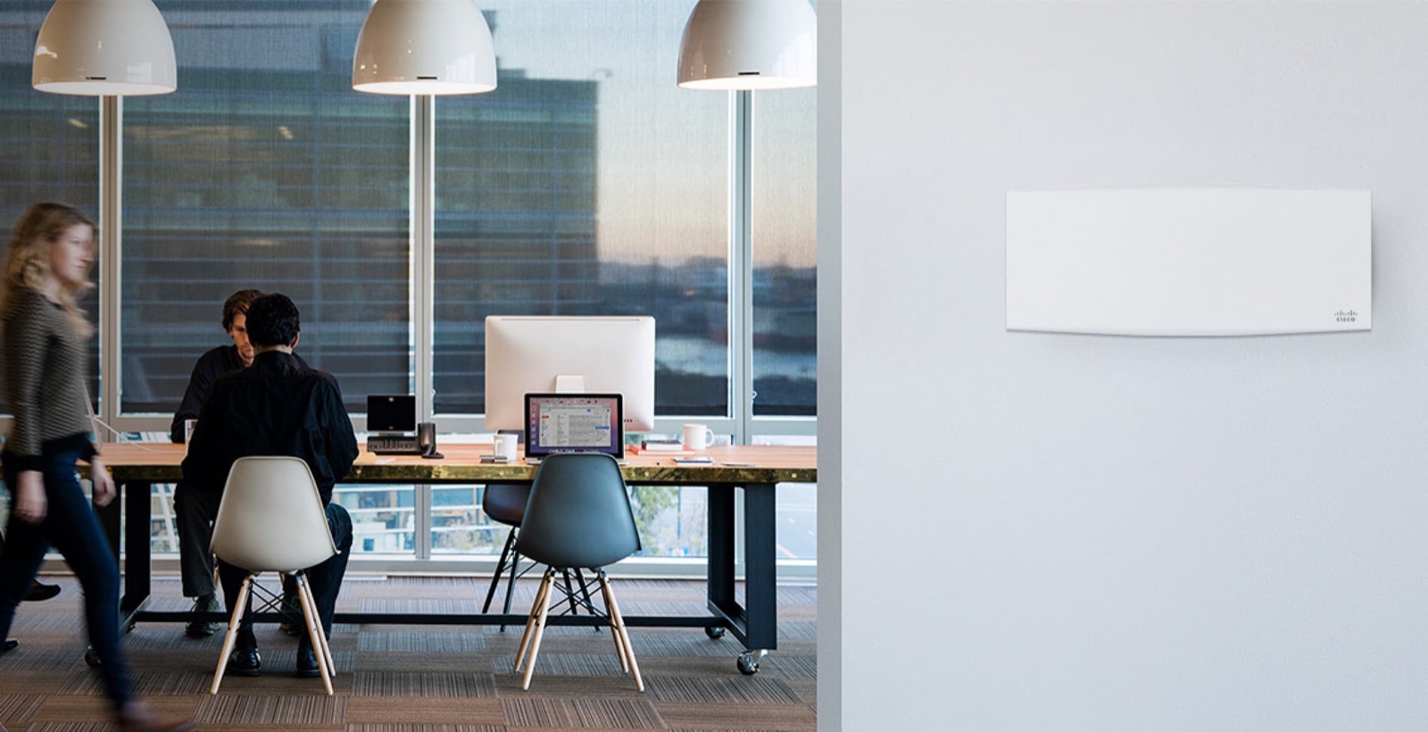
Access points with a famously clean design
Built for the places people actually work
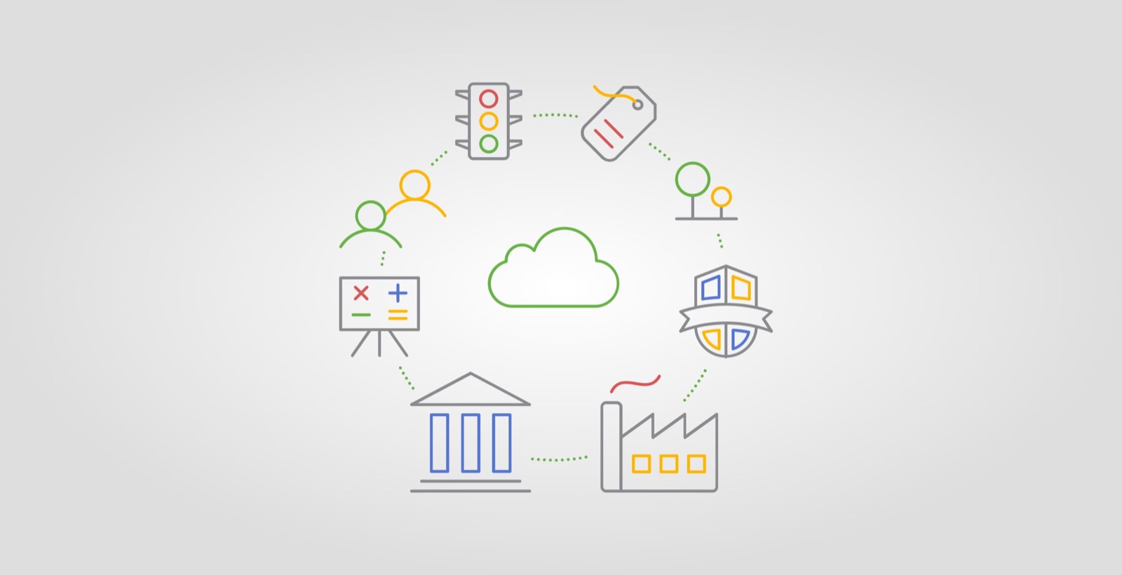
Cloud-managed: one platform behind every product
02 — The strategy

A brand refinement, not a rebrand.

Before we redesigned a single page, we agreed on style goals: a shared look and feel every new component could inherit. Moving from bespoke code to a CMS wasn’t a fresh coat of paint. It was a chance to rethink how Meraki shows up.

Meraki’s products win on a rare combination: easy to use and genuinely powerful. That balance is hard for engineers to hold, and I wanted the website to respect it. Clean new illustrations and infographics, intuitive navigation, a smoother path through the site, inclusive photography, and bold color that doubles as wayfinding.

A creative process can only absorb so many opinions. My job was to build real alignment across teams and keep the room ego-free.
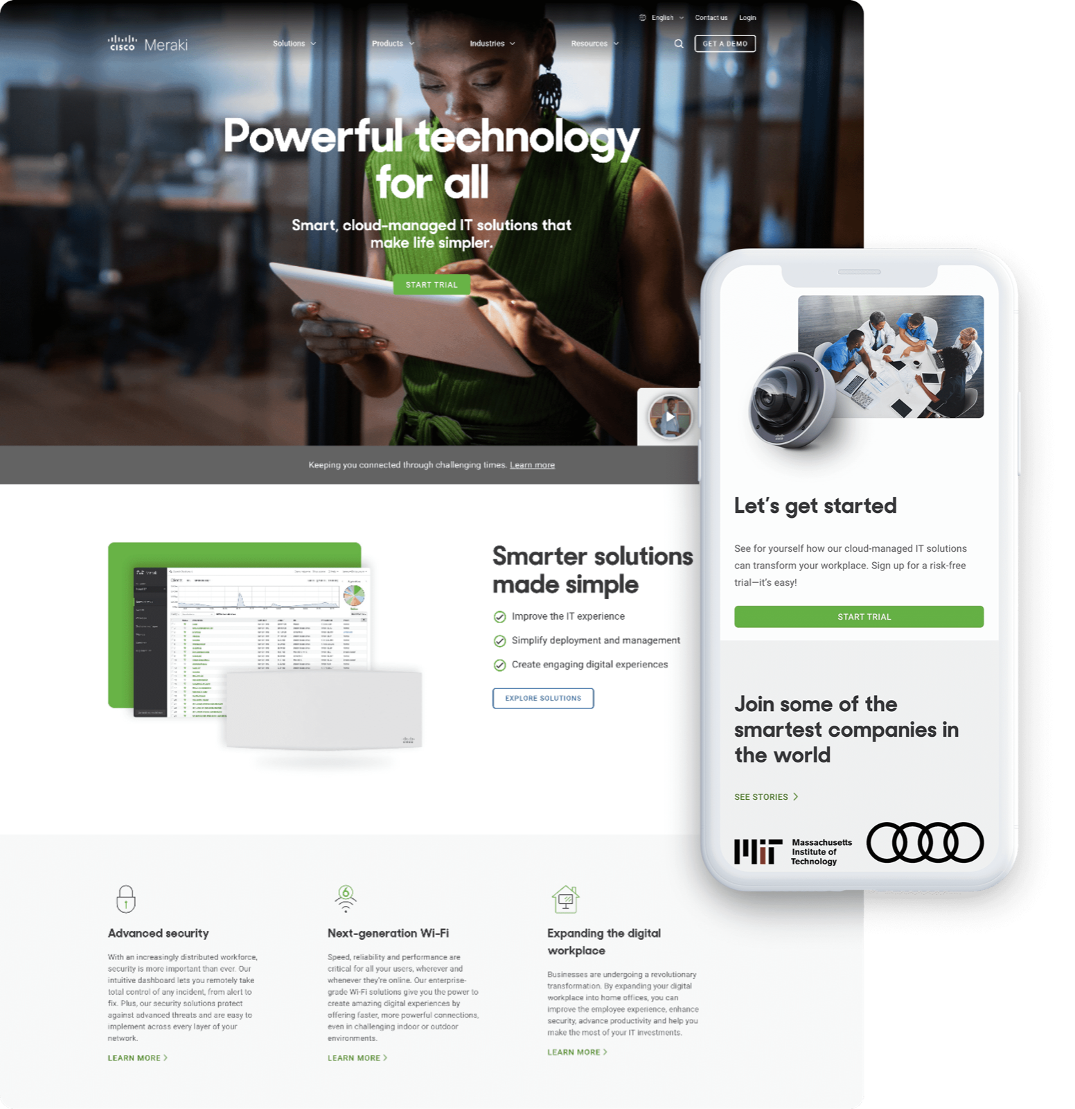
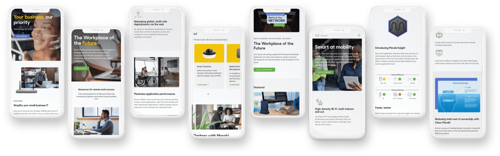
Fully responsive, from the homepage down to every product template
03 — The build

No MVP. A full redesign.

We set out to do a lift-and-shift and changed course early. Working directly with our brand-new CMO, I led a hybrid team: in-house UX and brand designers, a Head of Web I hired to own the site day to day, and our agency partner, Hero Digital.

We rebuilt the IA and navigation, rethought the messaging strategy, redesigned the homepage and every product template, and overhauled the iconography. Then we built new solution pages to position Meraki as a platform, not a line of products.
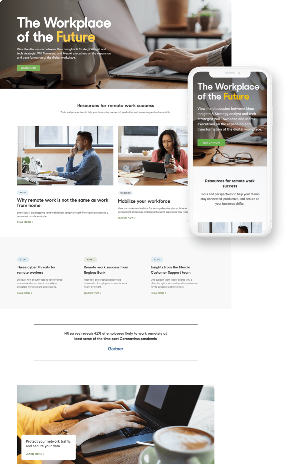
Campaign hub: the workplace of the future
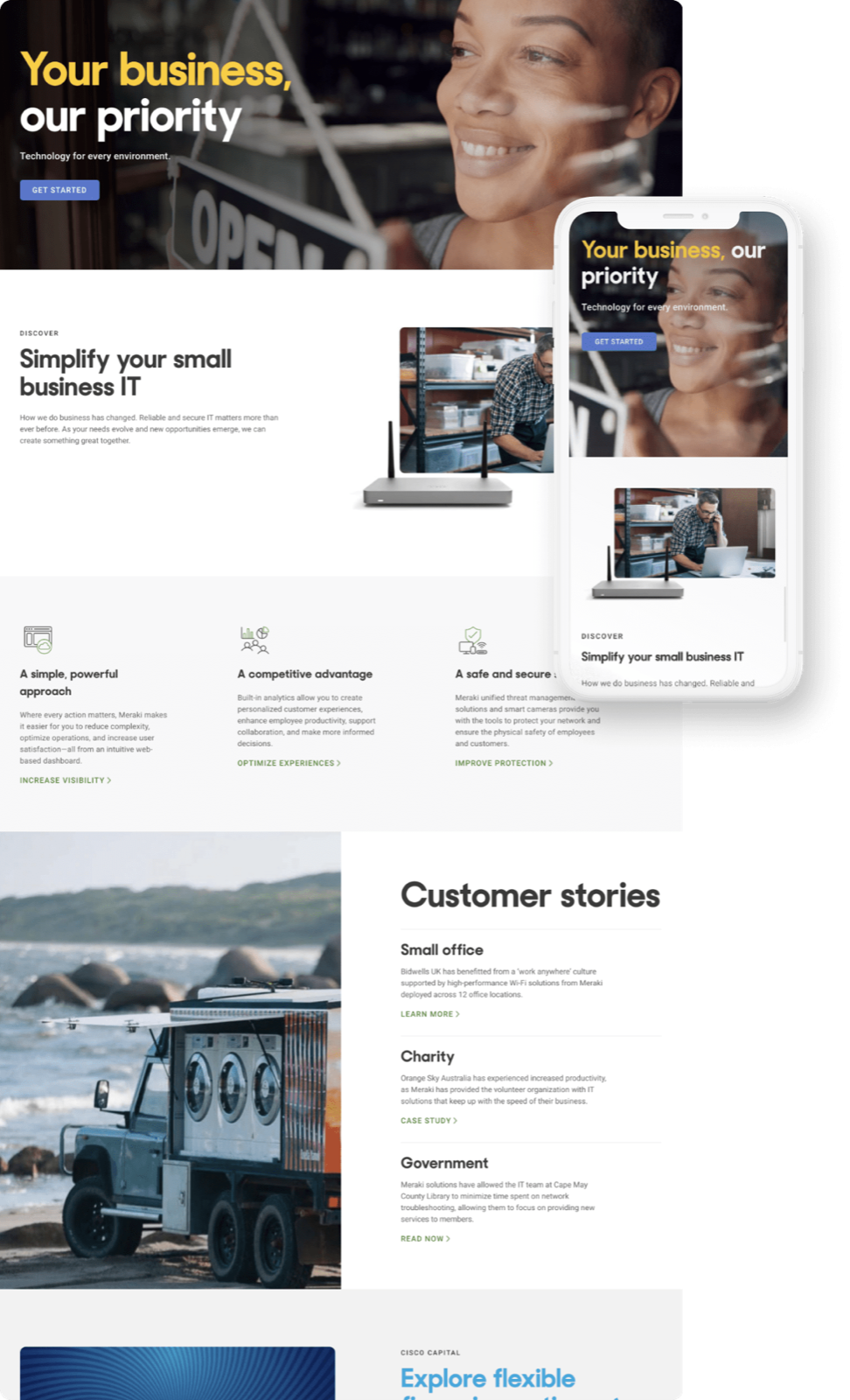
Solution page: small business, built as a platform story
Mobile, designed first rather than retrofitted
04 — The system

Bolder color. Sharper type. One icon language.

We refreshed the palette with bolder color and stronger photography, and upgraded the type stack to pair Sharp Sans with Roboto: a confident display face for headlines and a workhorse for everything the product team needed to explain.
Typography
Aa
Sharp Sans Display No. 2 — headlines
Aa
Roboto — body and UI
Color palette
Apple Green
#67B346
Indigo Blue
#5576D1
Supernova
#FFCD00
Alabaster
#F8F8F8
Mine Shaft
#393939
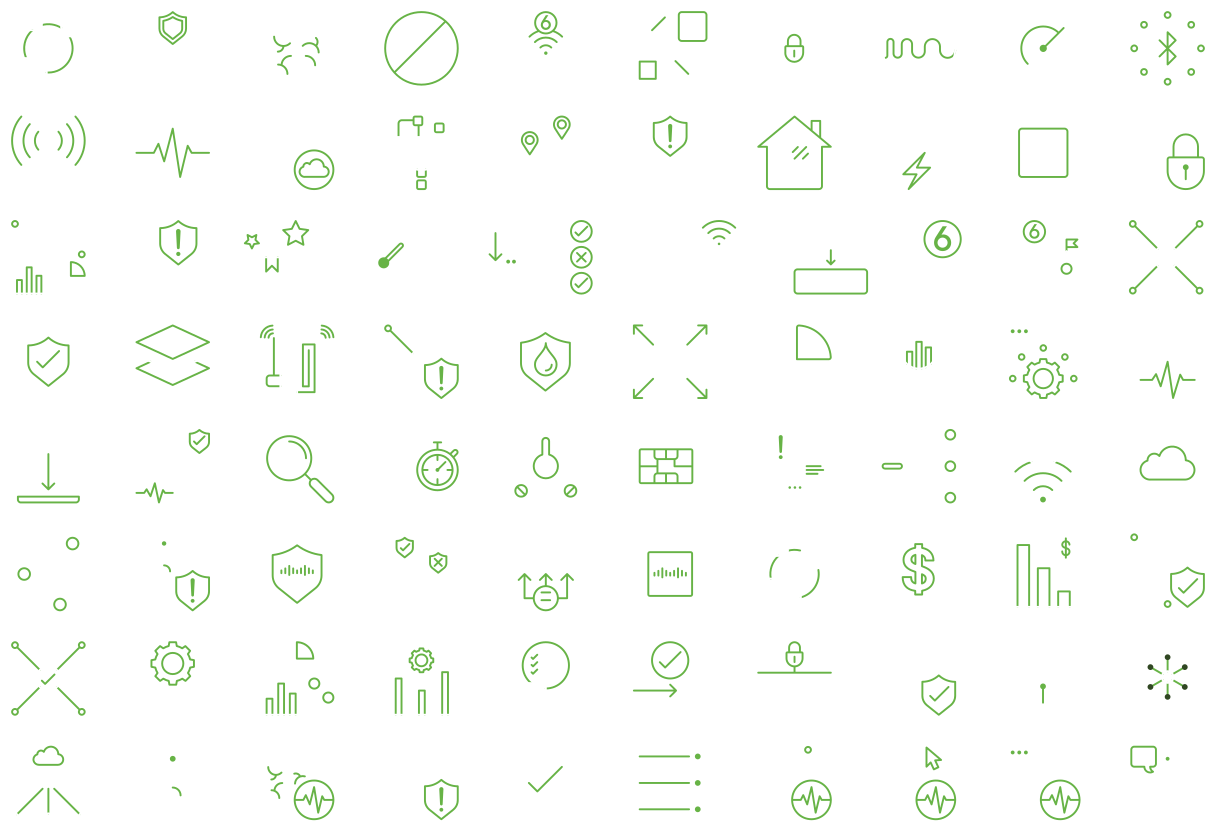
Icon set
The Meraki icon set
05 — Results
→+20–25% lift in overall conversion rate in early reads
→Lower bounce rate and longer average time on page
→Mobile compliance approaching 100% of pages
→Page loads up to 1,000% faster than the old site
→Removed years-old blockers so Marketing could ship campaigns, pages, and experiments faster
→Piloted the brand refresh and a new way of messaging products that carried across Meraki
Credits

Michelle B and Audrey T, UX Design · Julianne V, Ali G, and Adam L, Brand Design · Hero Digital, agency partner

← All work
Next case study
Being simple ain’t easy: Meraki’s first brand awareness campaign
→