SurveyMonkey · Project Catalyst · Visual identity system

Making SurveyMonkey look like SurveyMonkey again.
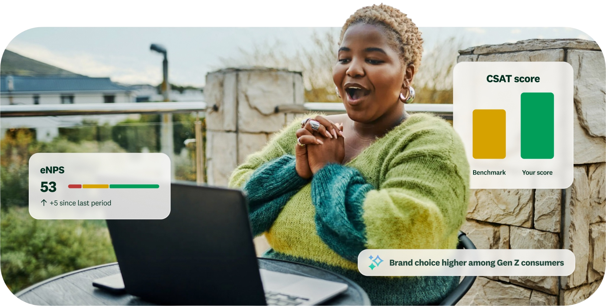
The refreshed SurveyMonkey brand across product and marketing
431
Design tokens rebuilt: color, type, and spacing
28,589
Component variants re-themed, light and dark
5
Figma libraries moved to the new system
AA
Contrast on buttons, type, and icons
Role
Head of Brand Creative. Set the strategy, led creative direction, and designed hands-on alongside the team
Team
Brand Creative studio, in partnership with the Catalyst product experience team
Scope
Brand, web, product, paid, social, email, and internal tools
Launched
August 2026, after two years of work. Announced with the Today’s SurveyMonkey campaign
01 — The problem

It started as an accessibility audit.

The first real conversation between Brand Design and Product Design was modest. SurveyMonkey’s accessibility scores needed work, and several brand colors didn’t meet contrast standards. The team had a to-do list, not a vision.

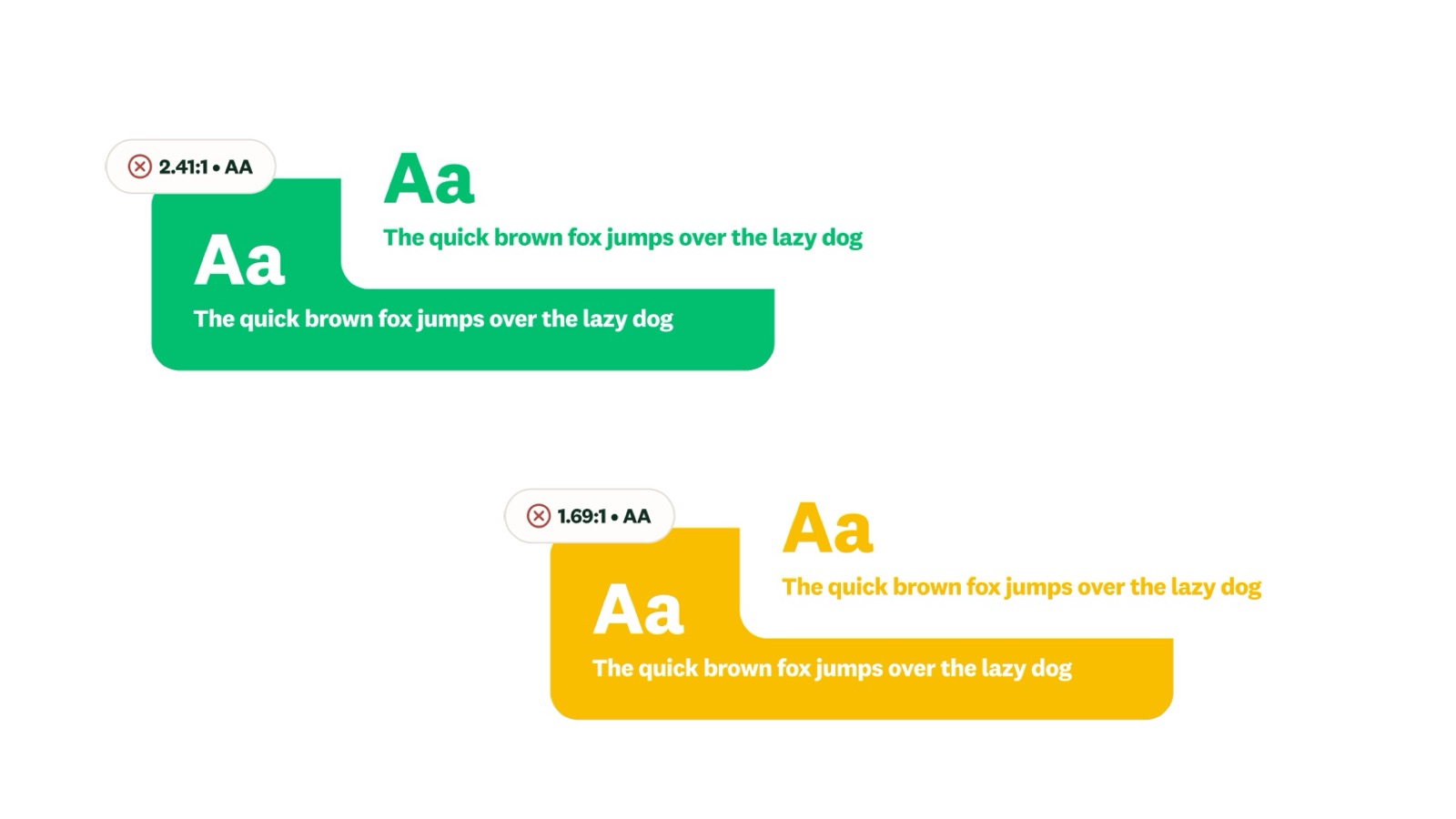
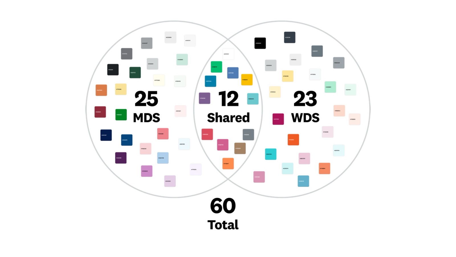
That to-do list was longer than it looked. Marketing and product ran on two separate design systems, with 60 colors between them and only 12 in common. The signature green and yellow failed contrast at 2.41:1 and 1.69:1. The homepage leaned on stock imagery generic enough that a visitor could fairly ask whether SurveyMonkey made headphones. And years after the company left the Momentive name behind, the brand was still wearing Momentive’s green and gray.

Once inside the color system, the team asked a question it had been sitting on: does the palette express who SurveyMonkey is, or work against it? Can color move people?
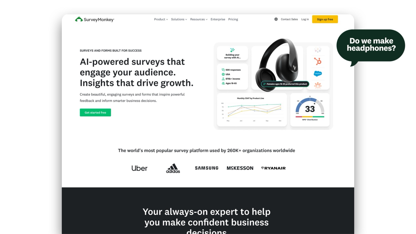
The old SurveyMonkey homepage with generic stock imagery
A homepage that could sell anything
Two design systems with 60 colors and 12 shared
Two systems, 60 colors, 12 shared
Brand colors failing AA contrast
02 — The insight

The recognition was there. The relevance wasn’t.

SurveyMonkey’s brand health tracker made the gap visible. Gen Z rated SurveyMonkey’s relevance 8 points below Millennials, and the Gen Z respondents who knew the brand best still didn’t feel it was for them.

That turned the brief from “refresh the look” into “give the next generation of buyers a reason to choose SurveyMonkey.”

Gen Z — relevance
64%*
Significantly below total avg (69%)
Millennials — relevance
72%*
Significantly above total avg (69%)
Gap
−8 pts
Gen Z vs. Millennials
Gen Z doesn’t know SurveyMonkey as well as it knows competitors, and the Gen Z respondents who do know the brand don’t feel it’s for them.
* Significantly different from total. NET strongly/somewhat agree among aware. Brand Health Tracker, N=4,538, 5/18–5/28/26. General population.
Brand health tracker: relevance by generation
03 — The strategy

Words before pixels: power the curious.

The Brand Personality Manifesto came first, so the identity would have something true to express. It reframed SurveyMonkey around the people who ask questions: the question-askers, the pressure-testers, the overburdened decision-makers. Its last line became the brief for everything that followed.

“We’re here to power the curious.”

“A hunch plus 500 validated opinions is just mathematically better.”
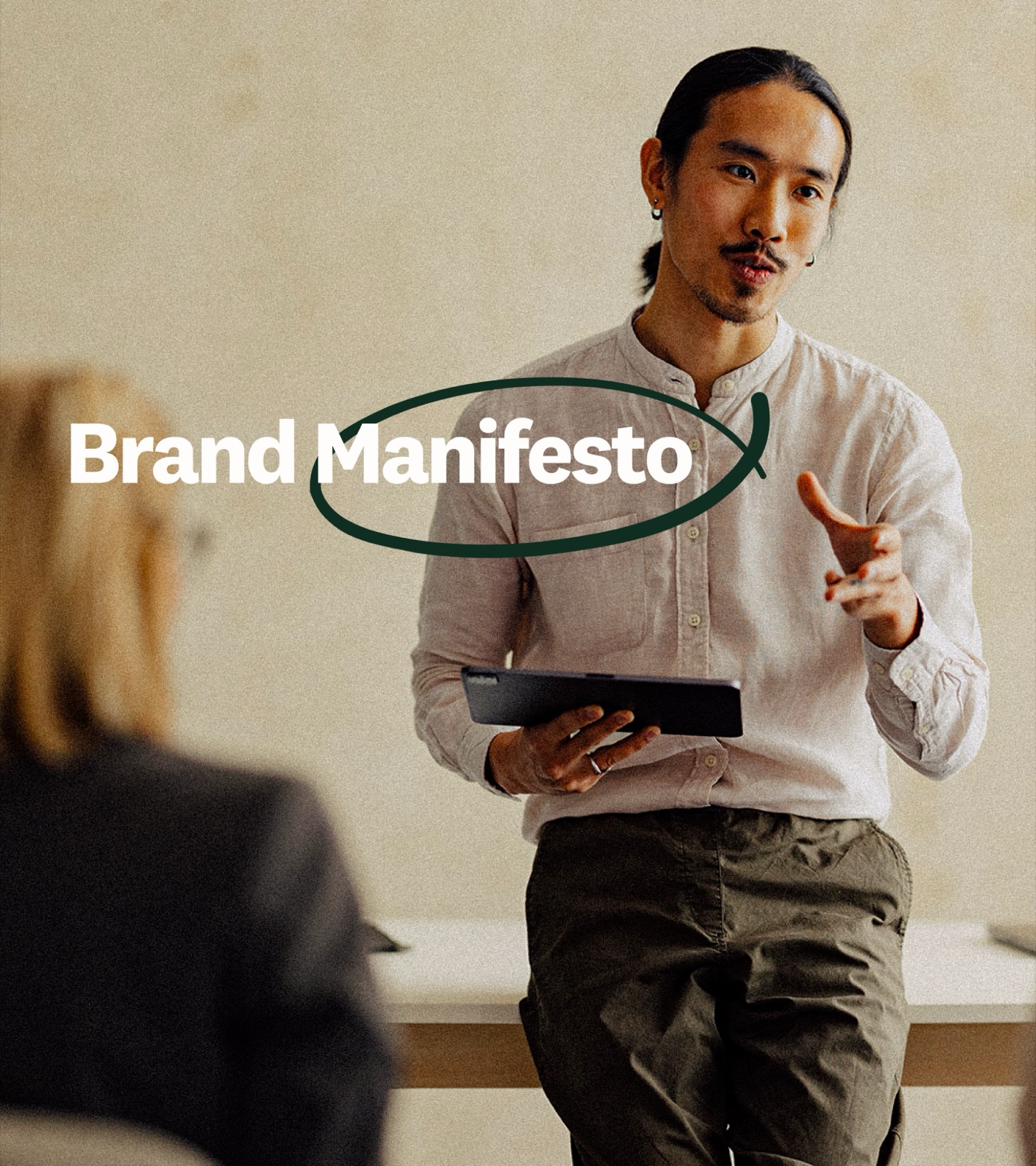
From the Brand Personality Manifesto
Manifesto artwork from the Catalyst identity
Pillars
Time has shaped us
Insights drive us
People inspire us
Design principles
Softer, more human by design
Guided with purpose. Less interface. More insight.
A warmer experience
04 — One team

One identity can’t be defined in two rooms.

Brand Design and Product Design had always been separate disciplines, each with its own roadmap, backlog, and stakeholders. But a visual identity can’t be split down the middle. Type that works in a product component has to hold up on a billboard. Motion that feels right on a landing page has to feel right inside the app.

So the two teams became one, working from one source of truth. That meant more debates than expected, and better outcomes because of them.

05 — AI’s role

Not the savior. Not the boogeyman.

Midway through the project, generative AI went from interesting demo to unavoidable conversation. The team wasn’t going to settle an industry debate about authorship and craft, but it did need a clear position for this work, because a vague one is a recipe for inconsistency.

The identity stayed human: type, color, motion, tone, and the spirit of the brand. AI earned a role in execution, moving work faster from ideation to production, scaling assets, and exploring variations. Not a replacement for design thinking, but a multiplier for design capacity.

“AI was never going to do the thinking for me, and it didn’t have to. What it did was eliminate the work that wasn’t thinking. Tasks that used to take hours now take seconds. That time didn’t disappear. It went back into the work that actually mattered.”

Ali Gerrity, Creative Director of Design
06 — The system

One system, built to feel human.

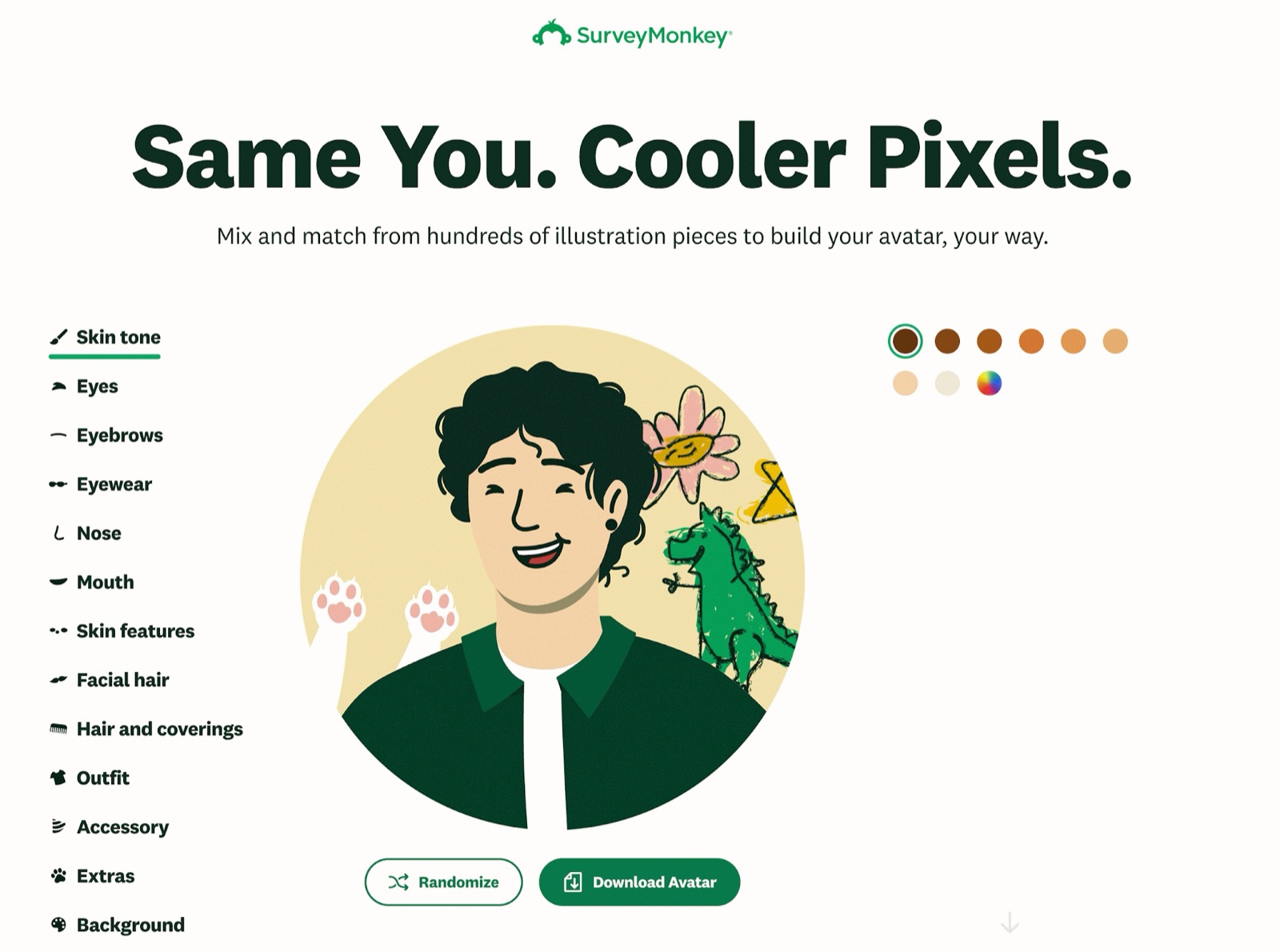
A refined core palette, a warmer illustration system, photography of real people doing real work, an avatar builder that lets anyone put themselves into the brand, and a product UI that finally matches the marketing.
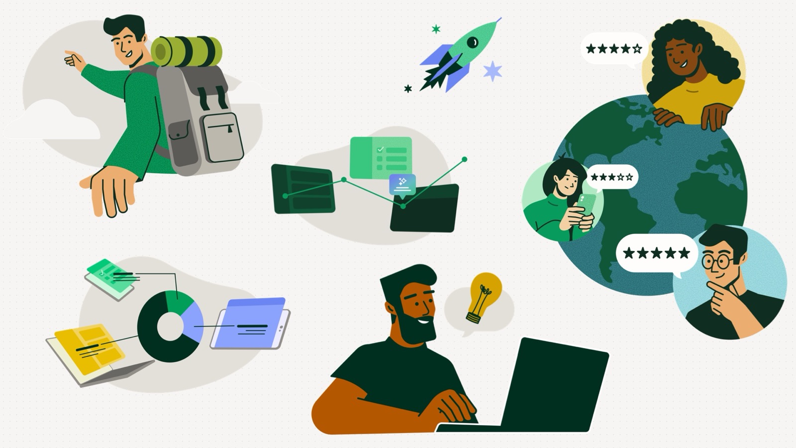
The Catalyst illustration system
Illustration system
Avatar builder: Same You. Cooler Pixels.
Avatar builder: “Same You. Cooler Pixels.”
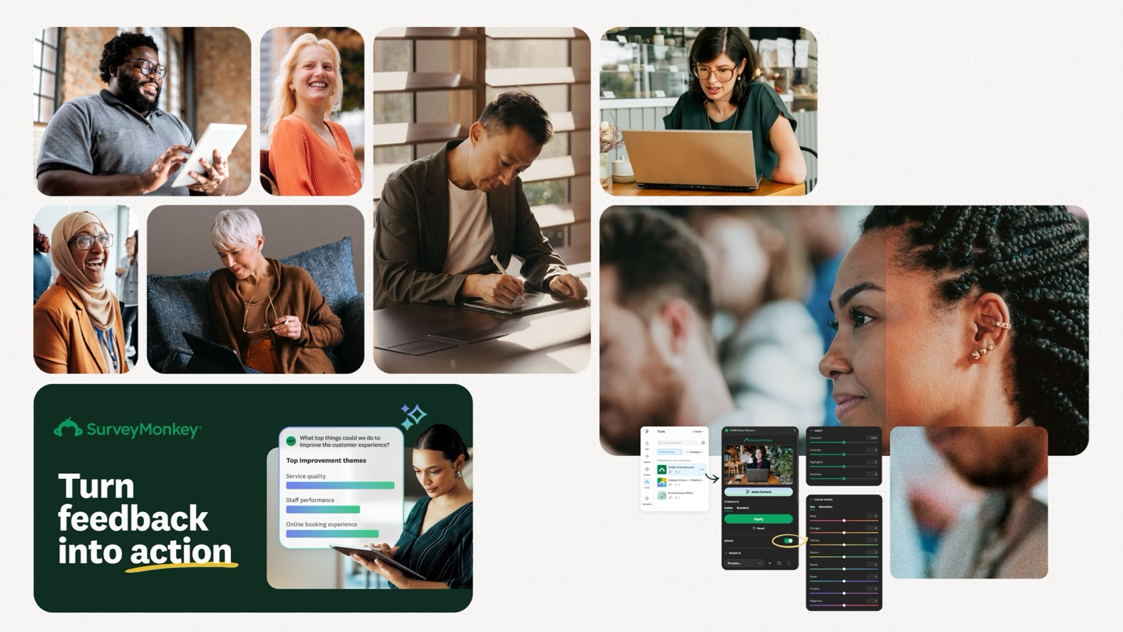
Photography of real people making real decisions
Photography: real people, real decisions
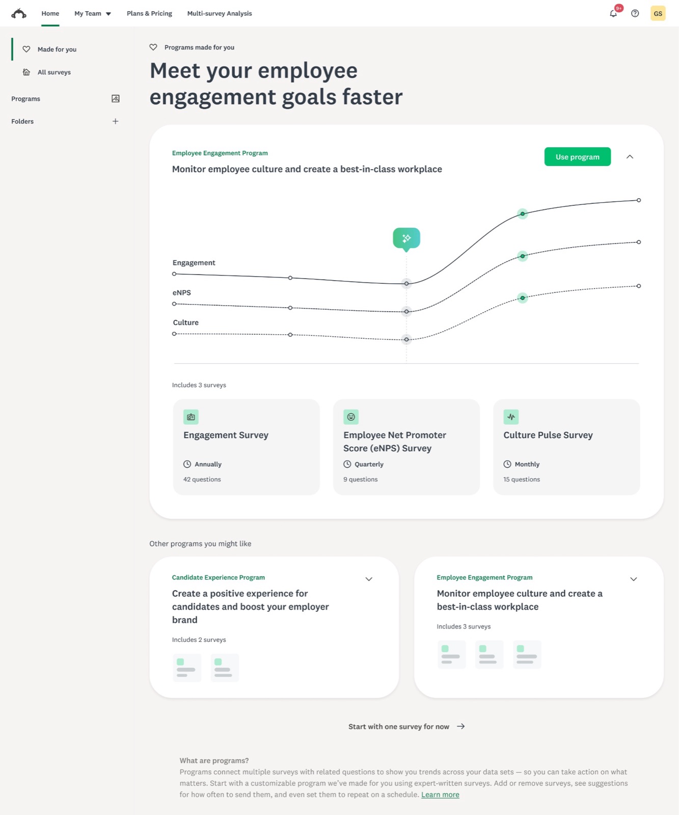
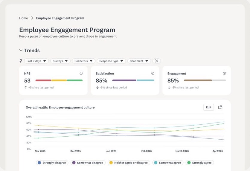
Employee engagement programs in the product
Product: employee engagement programs
Insights on the new system
Product: insights, on the new system
07 — The design system

The design system did the heavy lifting.

A beautiful identity can fall apart in production if the delivery mechanism isn’t built to hold it. The SurveyMonkey design system serves two audiences. For Brand Design, it’s the single source of truth: tokens, type scales, motion specs, and component behavior, with no final_final_v2 files floating around. For product, regional, and agency teams, it’s how they adopt the new visual language incrementally: new tokens that slot into existing components, and type that layers in without a redesign.

431
Color, type, and spacing tokens updated
10 → 34
Data visualization colors, for richer analysis themes
+13
New colors for LaunchPad, AI, and gradients
5
Figma libraries re-themed for a seamless rollout
507
Icons, logos, and components updated
28,589
Variants updated across size, color, and light and dark modes

“Our design system has two customers: our own team, who need to move fast and craft consistently at scale, and the person using SurveyMonkey, who needs the product to feel intuitive, insightful, and unmistakably ours.”

Tim Meissner, VP of Product Design and Research

It’s the difference between an identity that ships everywhere and a beautiful deck that lives in Figma.
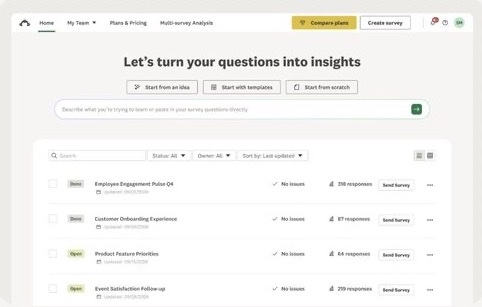
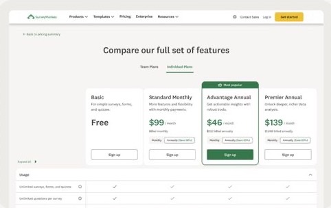
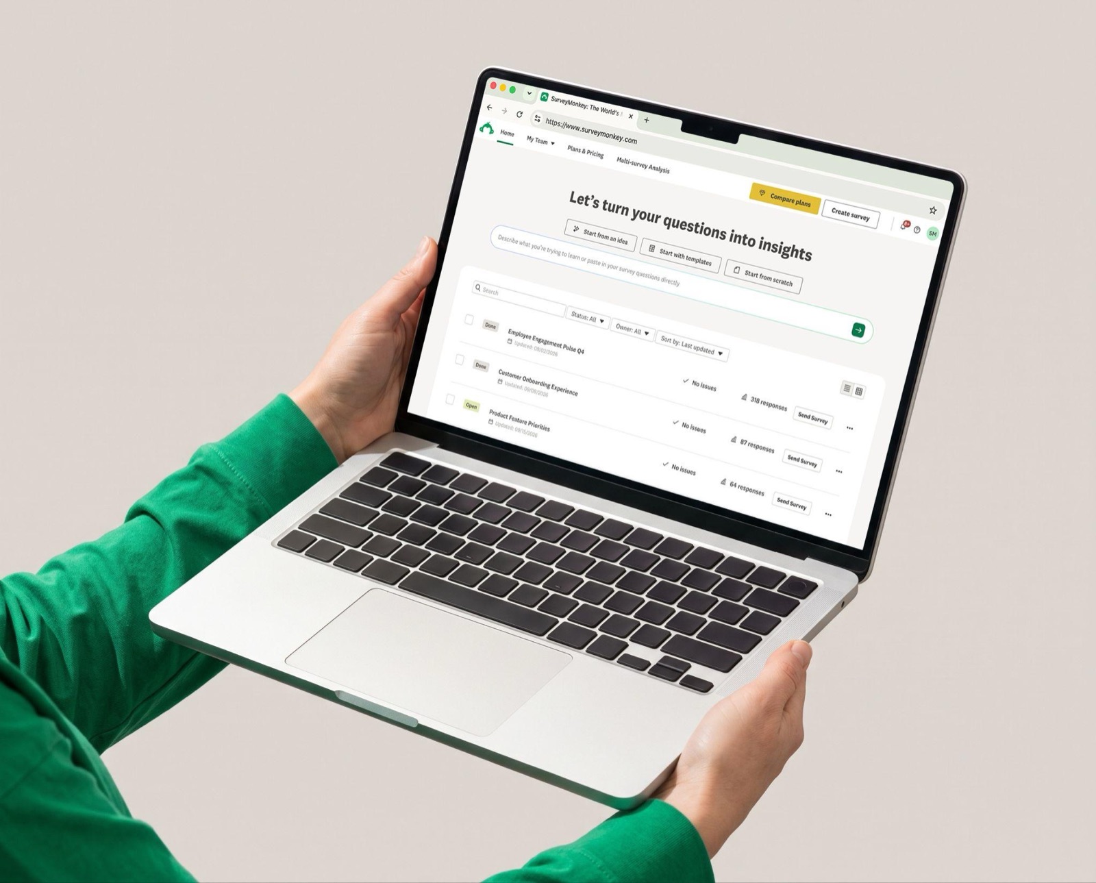
The Catalyst transformation in the SurveyMonkey product experience

SurveyMonkey home on the Catalyst systemSurveyMonkey plans and pricing on the Catalyst system
Employee engagement dashboard on the Catalyst system
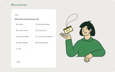
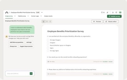
Onboarding with Catalyst illustrationAI survey builder on the Catalyst system
SurveyMonkey product screens on the Catalyst system: home, plans, engagement dashboard, onboarding, and the AI survey builder
Accessibility

Raising the bar on accessibility

Accessibility was a top priority across the whole Catalyst system, from buttons to type to icons.

✕ Not passing→✓ AA passing
Buttons: 2.37:1 → 5.37:1
Button textAA 2.37
Button textAA 5.37
Buttons
Hero 1 Bold
Hero 1 Medium
Hero 1 Regular
Hero 2 Bold
Hero 2 Medium
Hero 2 Regular
Typography
This is an example of a banner that displays a warning
This is an example of a banner that displays a notice
Icons
Accessibility: from failing to AA on buttons, type, and icons
AI prototyping

Catalyst powers faster, more accurate AI prototyping

Because the system lives in tokens and components, AI tools can build with the real SurveyMonkey design language instead of guessing at it.
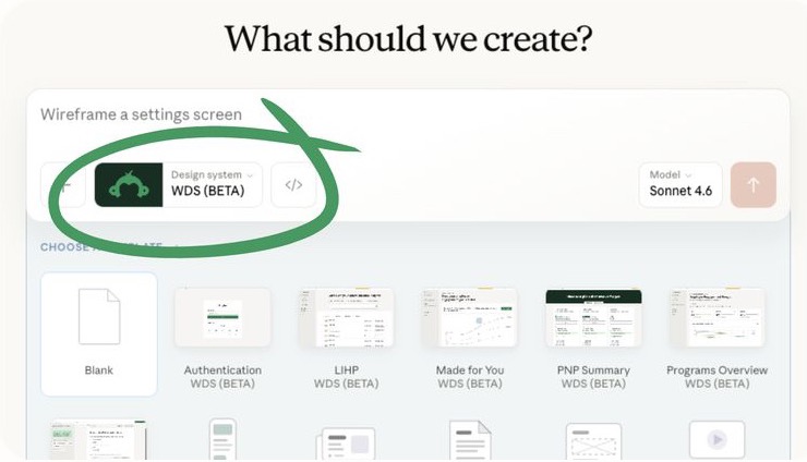
In beta
Catalyst AI prototyping in
Claude Design
Claude Design prototyping with the SurveyMonkey design system selected
Coming soon
Catalyst AI prototyping in
Claude Code
Claude Code artwork
The system now powers AI prototyping
08 — The rollout

Every touchpoint, all at once.

SurveyMonkey launched the new identity across every surface in one coordinated push, so it showed up everywhere on the same day instead of trickling out one page at a time.
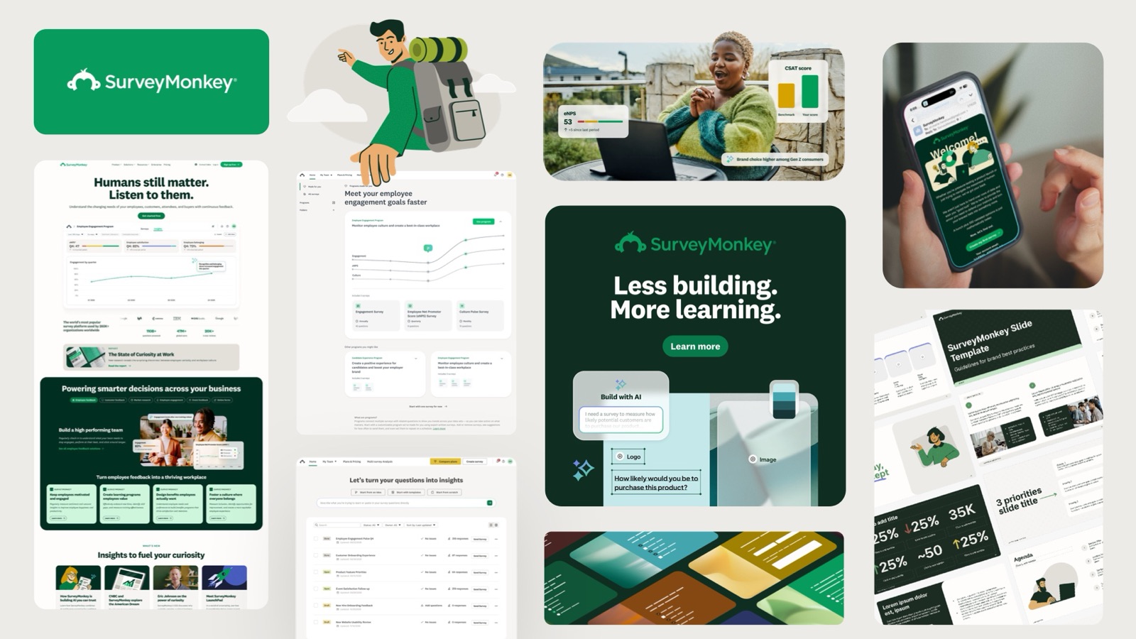
Logo colorColorIllustrationPhotographyTexturesType scaleRounded cornersButtonsFaviconHeader & footerWebEmailSocialPaid adsSlides & docsProductSurvey default themeShare cards
The new SurveyMonkey across web, product, social, and sales
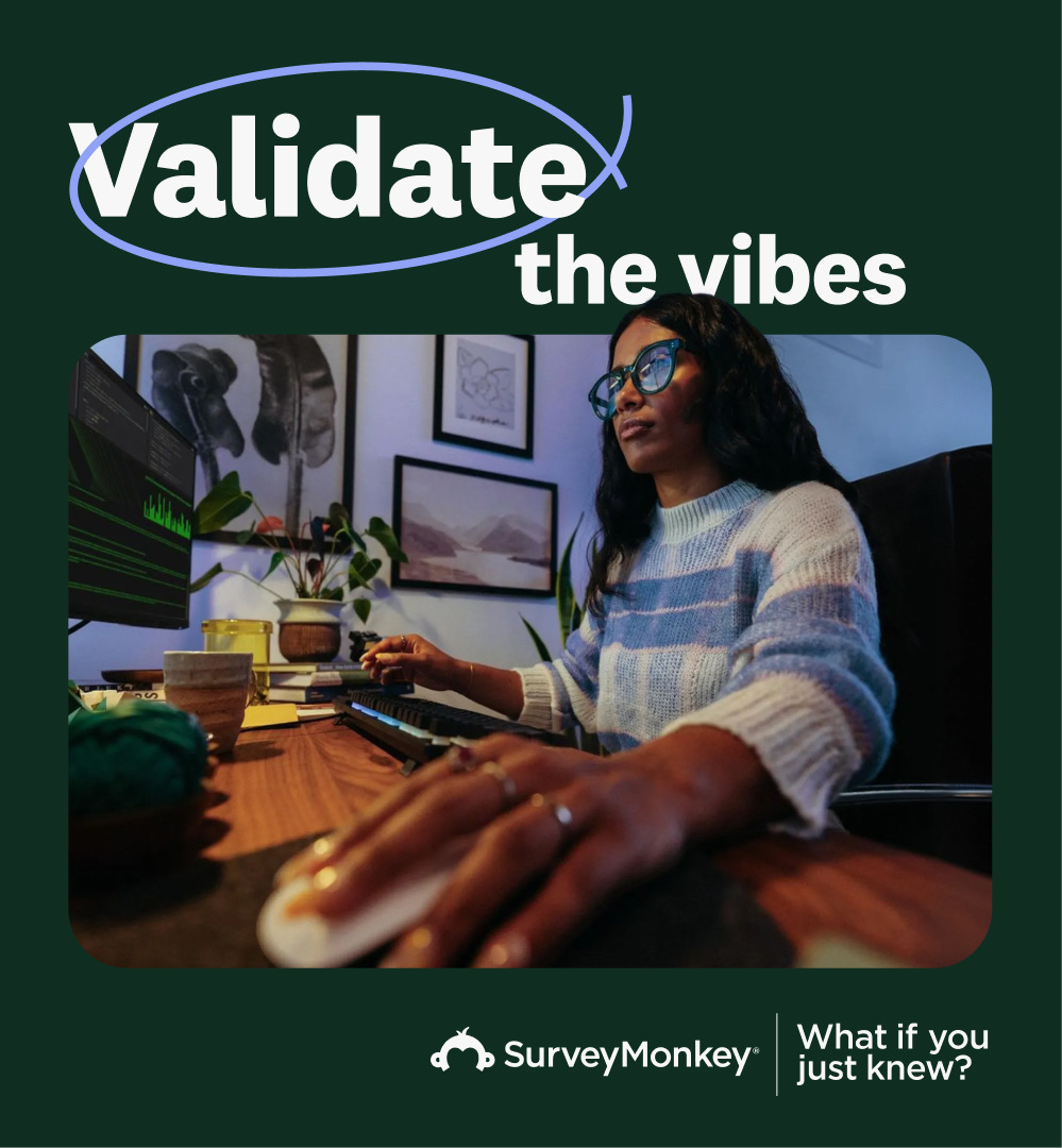
SurveyMonkey ad: Validate the vibes. What if you just knew?
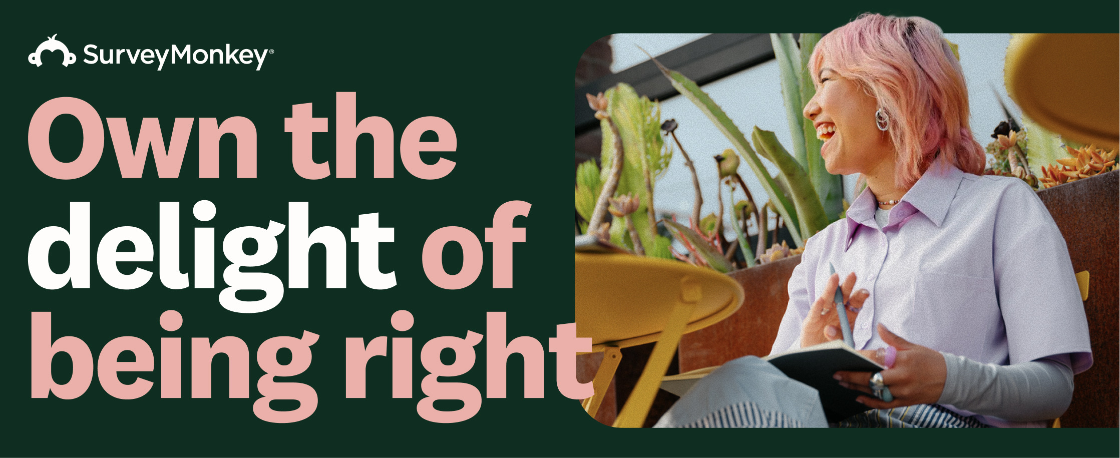
SurveyMonkey ad: Own the delight of being right
In market: campaign ads in the new identity
09 — Results
→431 tokens, 507 components, and 28,589 variants moved to the new theme across 5 Figma libraries
→Buttons, type, and icons moved from failing to passing WCAG AA contrast
→Two years from color audit to a company-wide identity, live across product and marketing
→Announced as part of the Today’s SurveyMonkey campaign, September 2026
→The new system became the foundation for AI prototyping in Claude Design
Credits

Brand Creative studio · Catalyst product experience team · Web

← All work
Next case study
A platform story, not a product catalog: the Cisco Meraki website
→